Chromatic harmony
Summer is here, and the colour gauge is rising! This summer, make Provence rosé wines the centrepiece of your table setting. Hues are as sunny as Provençal vistas.
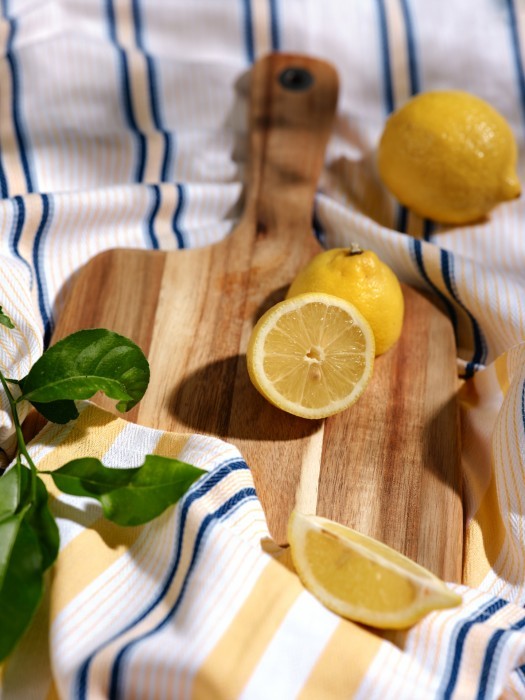
Lemon yellow
Bright, sunny, and luminous, it makes the table glow. Synonymous with summer and good times. But use it sparingly, or run the risk of sunburn.
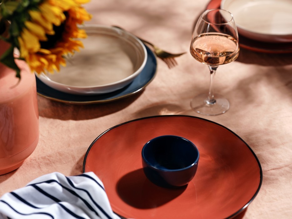
Midnight blue
Subtler than navy, midnight blue brings depth and contours to the setting. And as an added bonus, it is said to be relaxing.
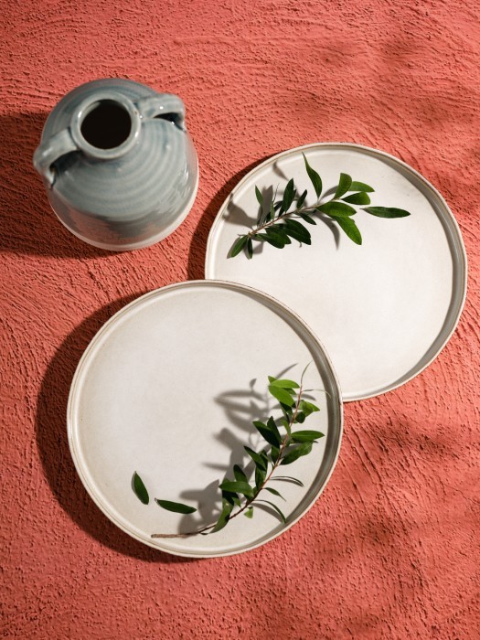
Lime white
Choose a shade of white that hints of sand. Lime white goes well with summer colours, but it can also be combined with other shades of white and beige to produce a refined ensemble.
Terracotta pink
A nod to handcrafted ceramics, the fired-clay colour of terracotta has an incandescent power. What colours does it go best with? Green and blue.
Eucalyptus green
Eucalyptus green
Rich in chlorophyll, this resolutely leafy shade is highly prized. And while you’re at it, if possible, opt for a variety of real green plants.